Back to all work

Multi-Brand Design System

Scaling a multi-brand, code-synced design system without a dedicated team.

Showcar foundations and components: typography styles, icons, form fields with an error state, toggles, checkboxes and radio buttons, colour tokens with contrast ratings, a blue colour scale, a car card, and the same tags and buttons themed for AutoScout24 and AutoTrader.ca.
Chapter 1. Context

A system nobody owned

When I took on leading Showcar, AutoScout24's design system, it had no owner. It was a loose collection of components, and how they were implemented in the product was patchy.

A new brand acquisition meant the company needed a system that worked across the company, and fast. I led the project alongside my product work, bringing in the wider UX team to contribute next to my own hands-on work.

Chapter 2. The problem

Design drift, and a second brand

Without an owner or a shared source of truth, every team solved the same problems in its own way. Signed-off designs would appear differently in production.

Additionally, a new requirement appeared: our design system had to support the newly acquired AutoTrader.ca in Canada, a company with a different brand. The acquisition only made sense if both businesses ran on one platform. To support that, the design system had to become far more complete, and it had to carry more than one brand.

Six confirmation modals from production, each built differently: yellow or outlined buttons in either order, full-width or compact buttons, left-aligned or centred titles, different close icons, and a dark primary button on an onboarding dialog.
The six modal styles found in production.
Chapter 3. Design

Building it with people, not for them

  • A way to contribute. I set up a contribution process: a dedicated Slack channel and a bi-monthly UI Guild call where designers could propose new components or changes to existing ones.
  • Components with the UX team. I worked with the UX team to design the components and write their documentation, so every addition shipped with guidance on how to use it.
  • Engineers who cared. I looked for the engineers who were passionate about the system and wanted to build it together, and made them part of the core group.
  • Tokens that match one to one. I created a token system that syncs Figma variables with the development tokens, so design and code always hold the same values. Switching brand became a change of token set rather than a redesign.
  1. ProposeA designer with a need brings it to the UI Guild or the Slack channel
  2. Quality gateThe community decides: a new component, or an update to an existing one
  3. Design and documentThe contributor designs it and writes the documentation
  4. BuildThe product development team adds it to the design system repo
Semantic and component tokens in Figma, with a column per brand mode (AS24, AS24-Future, ATCA). Each brand maps the same token to its own colour, for example surface brand is yellow for AS24 and red for ATCA. A menu shows the mode switcher: AS24, AS24-Future, ATCA, LM, GWAT, ATNL, AKNL and wireframe modes.
Brand themes as variable modes in Figma.
Showcar button documentation: a Do's panel (use primary and secondary buttons to show importance; use transparent buttons for less important actions), a Don'ts panel (avoid multiple primary CTAs in one section, don't use floating buttons inline, avoid super-wide CTAs), and guidance on when to use hug or fill width, each with live examples.
Every component ships with documentation.
Chapter 4. Impact

One system, many brands

38components fully implemented
10+products built on it

Showcar is now complete enough to build on. It underpins search, the private seller flow and the key dealer interfaces, and it supports multiple brands through its tokens. One system now carries 6 distinct brands, the foundation that running these businesses on one platform depended on.

Because design and code share the same tokens, what designers specify is what engineers build.
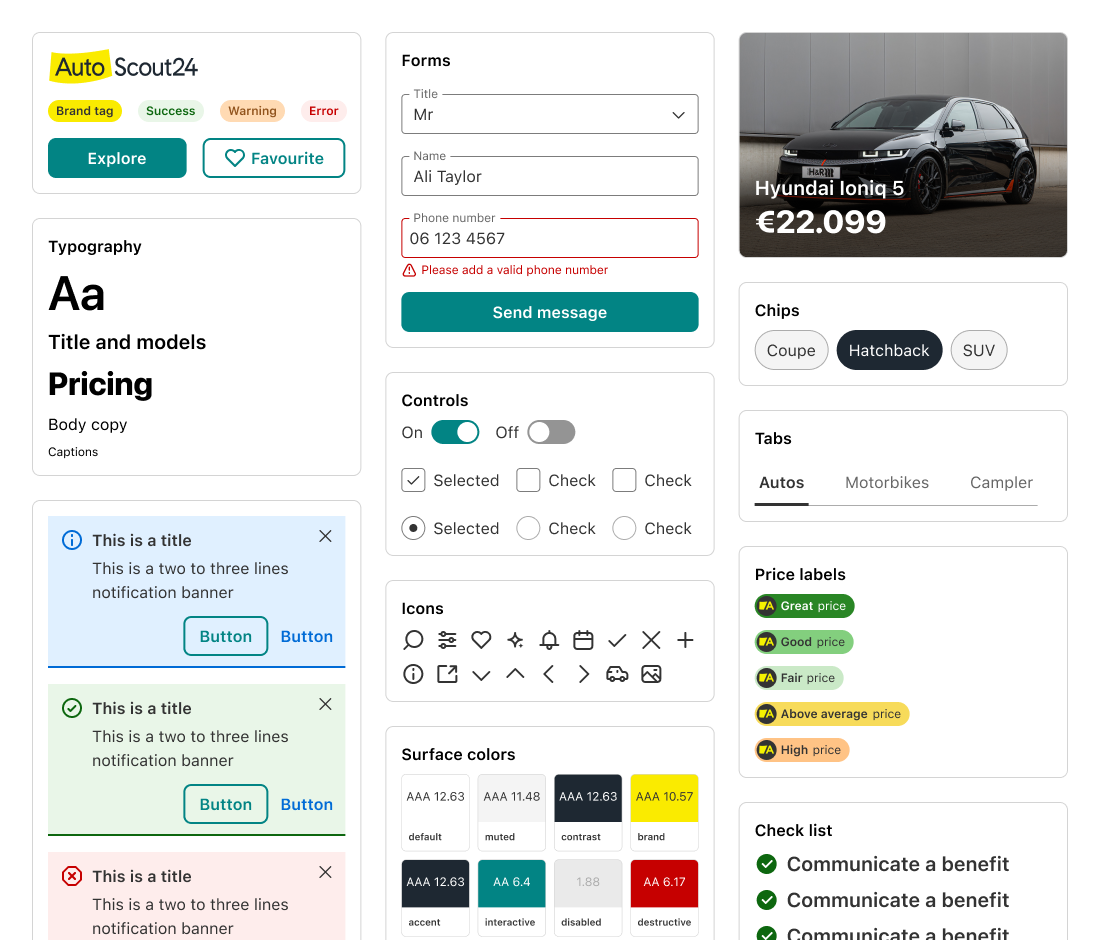
Showcar components themed for AutoScout24: logo, tags and buttons, typography, form fields with an error state, a send button, toggles, checkboxes and radio buttons, notification banners, icons, surface colours with contrast ratings, a car card, chips, tabs, price labels and a check list.
Components
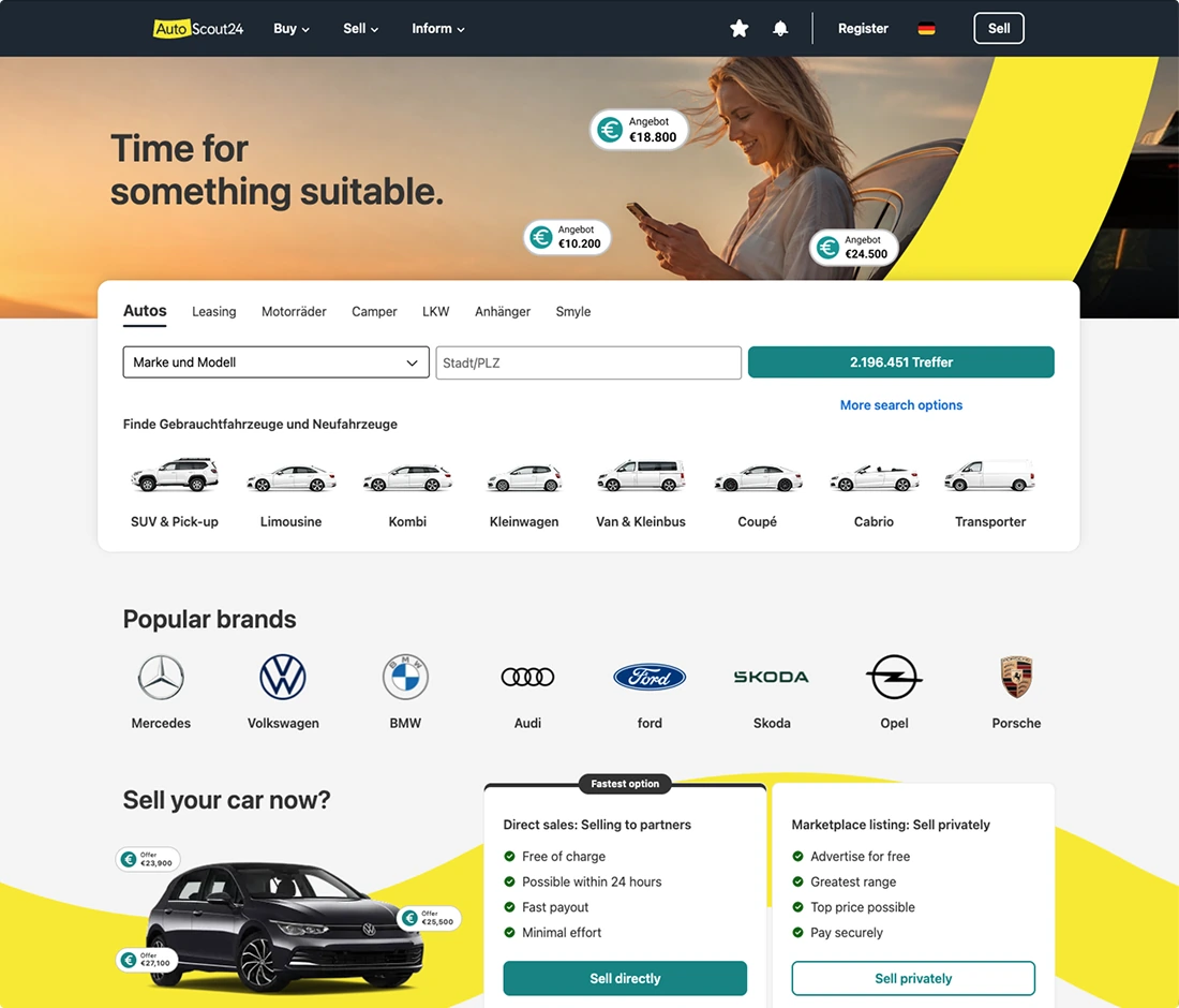
The AutoScout24 homepage built with Showcar: brand header and hero image, the search panel with body-type shortcuts, popular brands, and the sell-your-car module.
Homepage
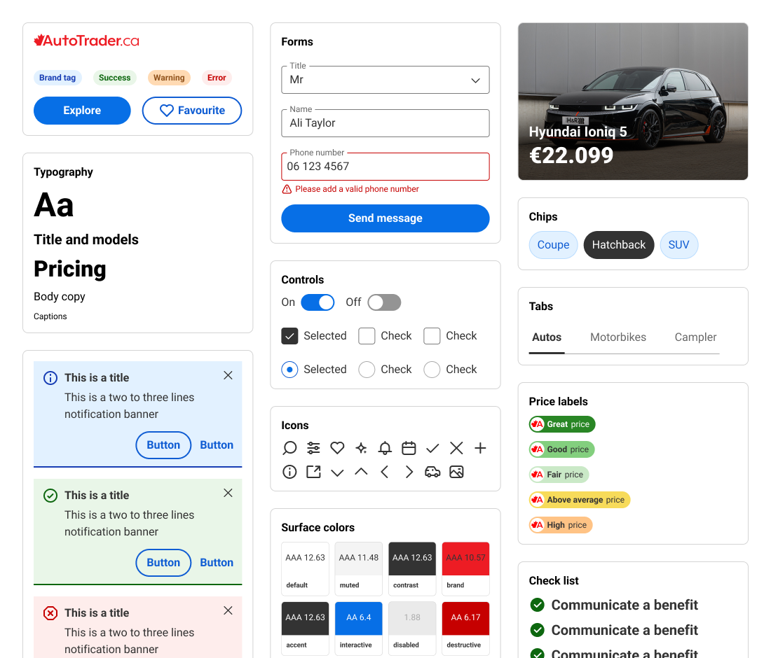
Showcar components themed for AutoTrader.ca: logo, tags and buttons, typography, form fields with an error state, a send button, toggles, checkboxes and radio buttons, notification banners, icons, surface colours with contrast ratings, a car card, chips, tabs, price labels and a check list.
Components
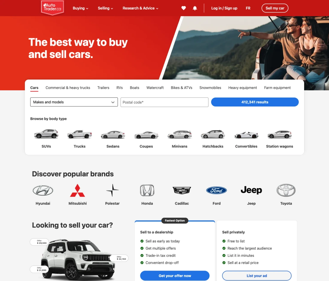
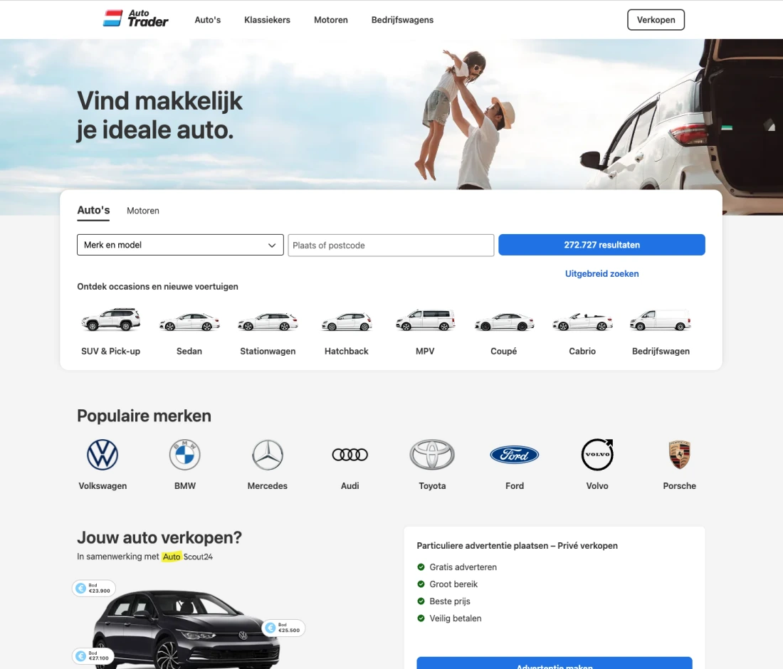
The AutoTrader.ca homepage built with Showcar: brand header and hero image, the search panel with body-type shortcuts, popular brands, and the sell-your-car module.
Homepage
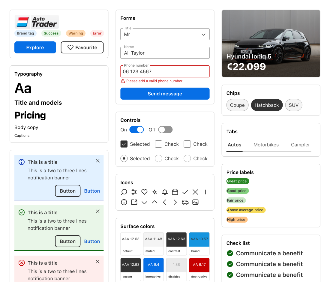
Showcar components themed for AutoTrader.nl: logo, tags and buttons, typography, form fields with an error state, a send button, toggles, checkboxes and radio buttons, notification banners, icons, surface colours with contrast ratings, a car card, chips, tabs, price labels and a check list.
Components
The AutoTrader.nl homepage built with Showcar: brand header and hero image, the search panel with body-type shortcuts, popular brands, and the sell-your-car module.
Homepage
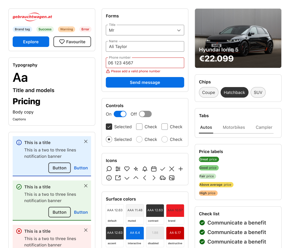
Showcar components themed for gebrauchtwagen.at: logo, tags and buttons, typography, form fields with an error state, a send button, toggles, checkboxes and radio buttons, notification banners, icons, surface colours with contrast ratings, a car card, chips, tabs, price labels and a check list.
Components
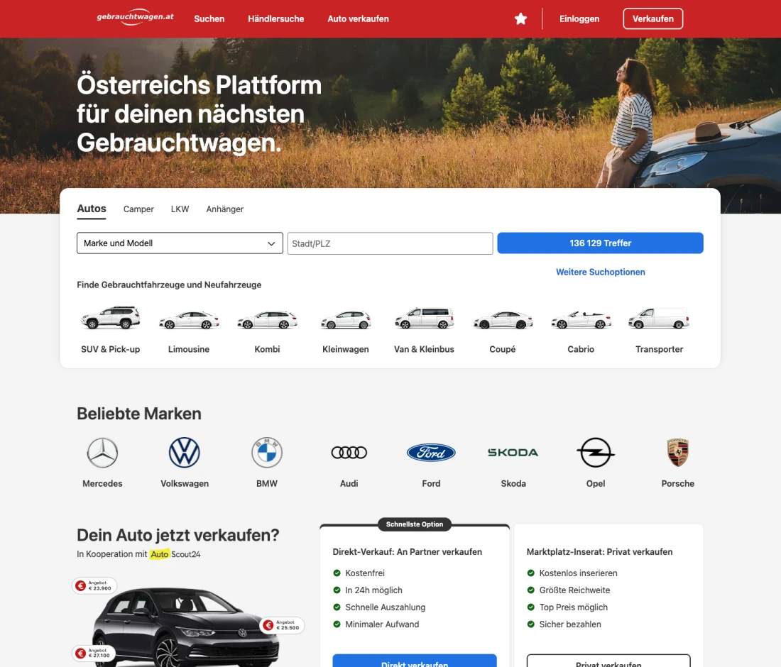
The gebrauchtwagen.at homepage built with Showcar: brand header and hero image, the search panel with body-type shortcuts, popular brands, and the sell-your-car module.
Homepage
Chapter 5. What next

AI agents are becoming a customer for the design system.

As AI transforms our workflow, the design system sits at the heart of that transformation. I'm now working on integrating it with Figma Make and Codex, and making the documentation machine-readable, so agents can build to the same standard as the team.

Want the full story?

The full multi-brand design system case study, with the numbers, is a conversation away.

sayhi@alitaylor.nl