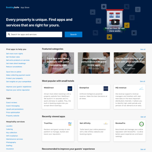
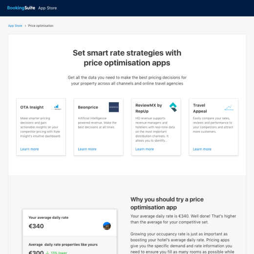
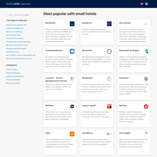
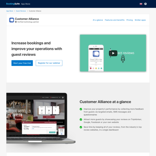
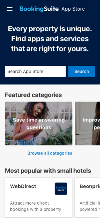
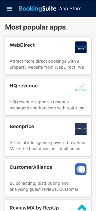
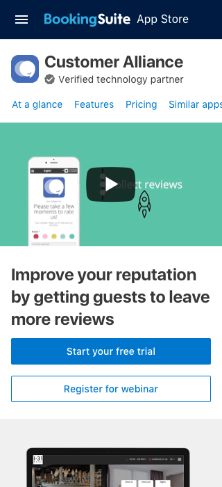
I was challenged with creating a solution that would help hotels adopt software. As the sole designer I led research and design on this project from inception until it's launch. The solution, BookingSuite’s App Store, had thousands of purchases within days of launching.


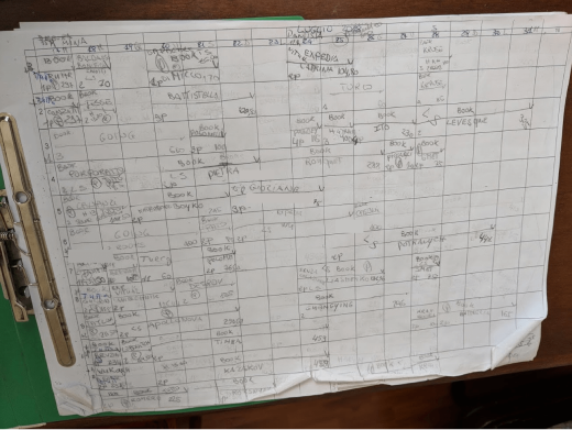
I kicked off this project by interviewing some of Booking.com's accommodation partners in Florence, Italy. I created a discussion guide which helped myself, our Product Manager and Marketing Manager conduct the interviews and learn how we could make running their businesses easier and more efficient.
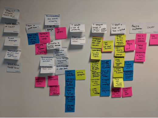
To document our findings, I created a user journey map, referring back as much as we could to real life examples from the managers we had spoken to. It didn't take us long to pinpoint the main problems.
With a solid understanding of the problem, I ran a design sprint to come up with solutions to the problems I’d identified. I planned and facilitated a design sprint bringing in the team of developers, product managers and copywriters who would be working on the project.
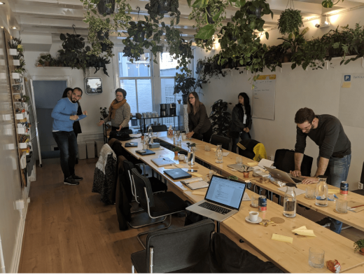
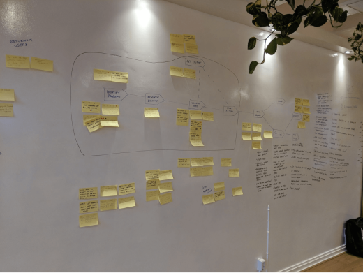
I brought our research findings, journey map and outside experts’ knowledge and transformed it into "How Might We" notes to group our insights. Once we’d started brainstorming and sketching solutions we invited leadership stakeholders to make sure they were bought in too.
At the end of the week we'd come up with a solution we thought had promise - an app store of hospitality software which we hoped would solve our hotelier's problems with standardised listings, transparent pricing, and automatic setup.
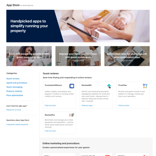
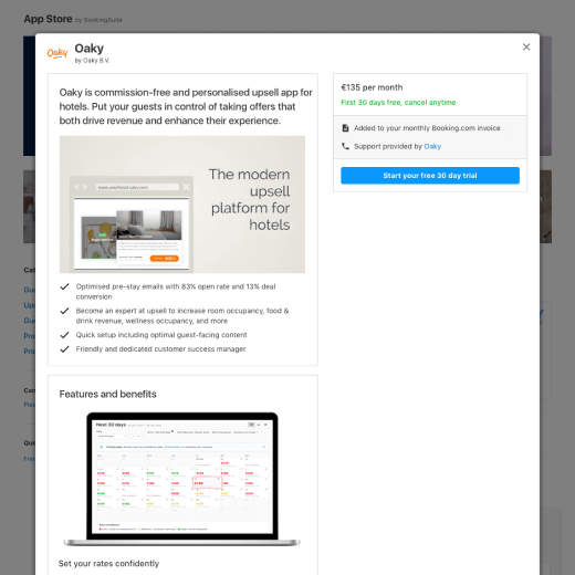
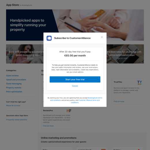
After creating a prototype, I returned to interview hoteliers and test our hypothesis. Hoteliers revealed our store concept had promise, along with some details to improve upon.
With confidence in our concept, we decided on an MVP and worked towards launching the store. To help understand what shape our MVP would take I facilitated a prioritisation session to decide what was critical, and what could wait until later.


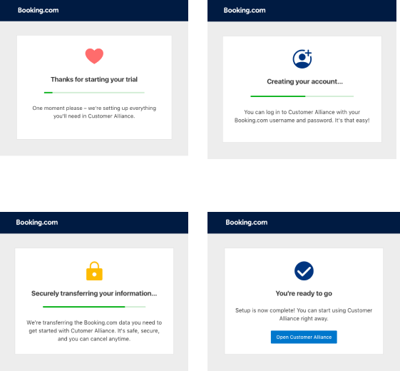
We tracked behavioural metrics along with business metrics like number of trials and conversion to purchase to measure our overall success. As this was a new product we compared our results to industry benchmarks and landing pages we’d used to sell our in-house software.
Along with the quantitative metrics, I also had regular check-ins with our support team to understand any issues and possible future improvement areas.
After a successful soft launch to a small set of users we developed key missing features like improved search and category pages in time for a public launch at ITB Berlin, Europe's largest travel trade show. Within hours of the launch the store had thousands of hotels visiting and signing up for products. The team at the event reported users delight at how easy it was to find and try software for their business.
Next project