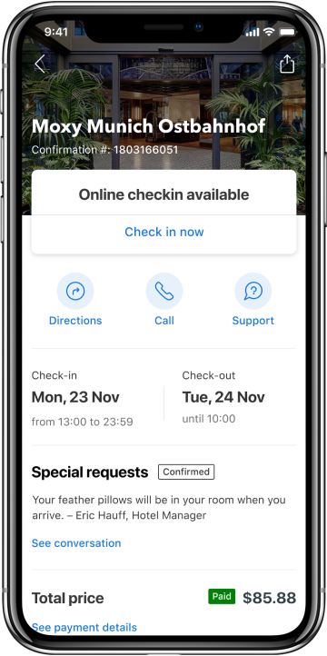
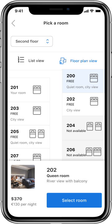
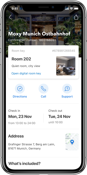
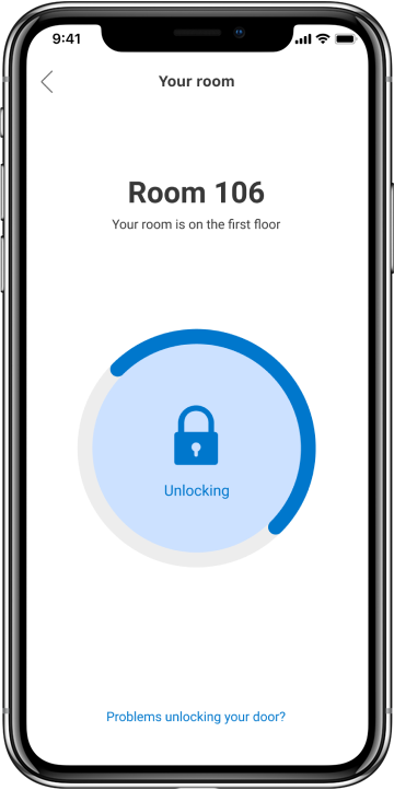
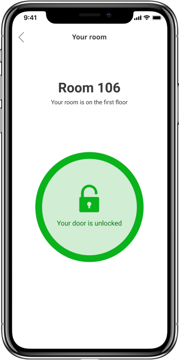
This project started with a simple question; “How can we enable our hotel partners to provide guests with a seamless, personalised and delightful travel experience?” I was the sole designer on the project from inception to the launch of the MVP.


I gathered existing research from around the business and kicked off an inception sprint with a team of designers, copywriters and product managers. I invited experts from the business including customer service executives and local partners experts to help us understand guests’ problems. At this critical moment I brought in senior management stakeholders to help us identify which opportunity would have the backing of the business. At the end of our sprint, we’d identified the hotel check-in experience as a point of friction that we could transform through technology.
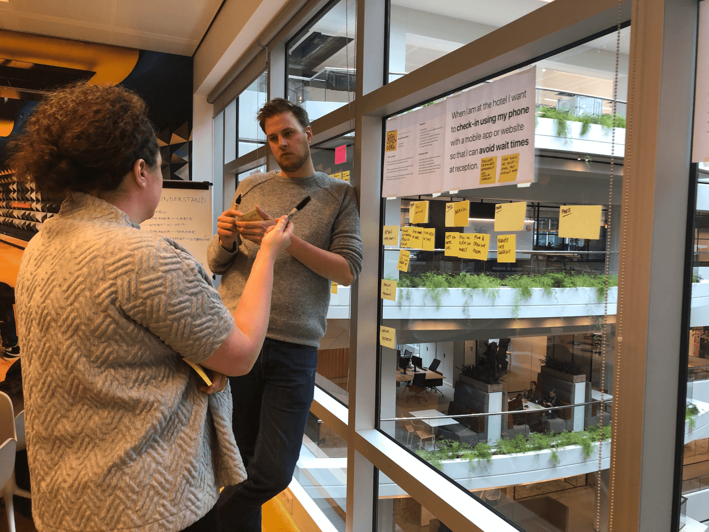
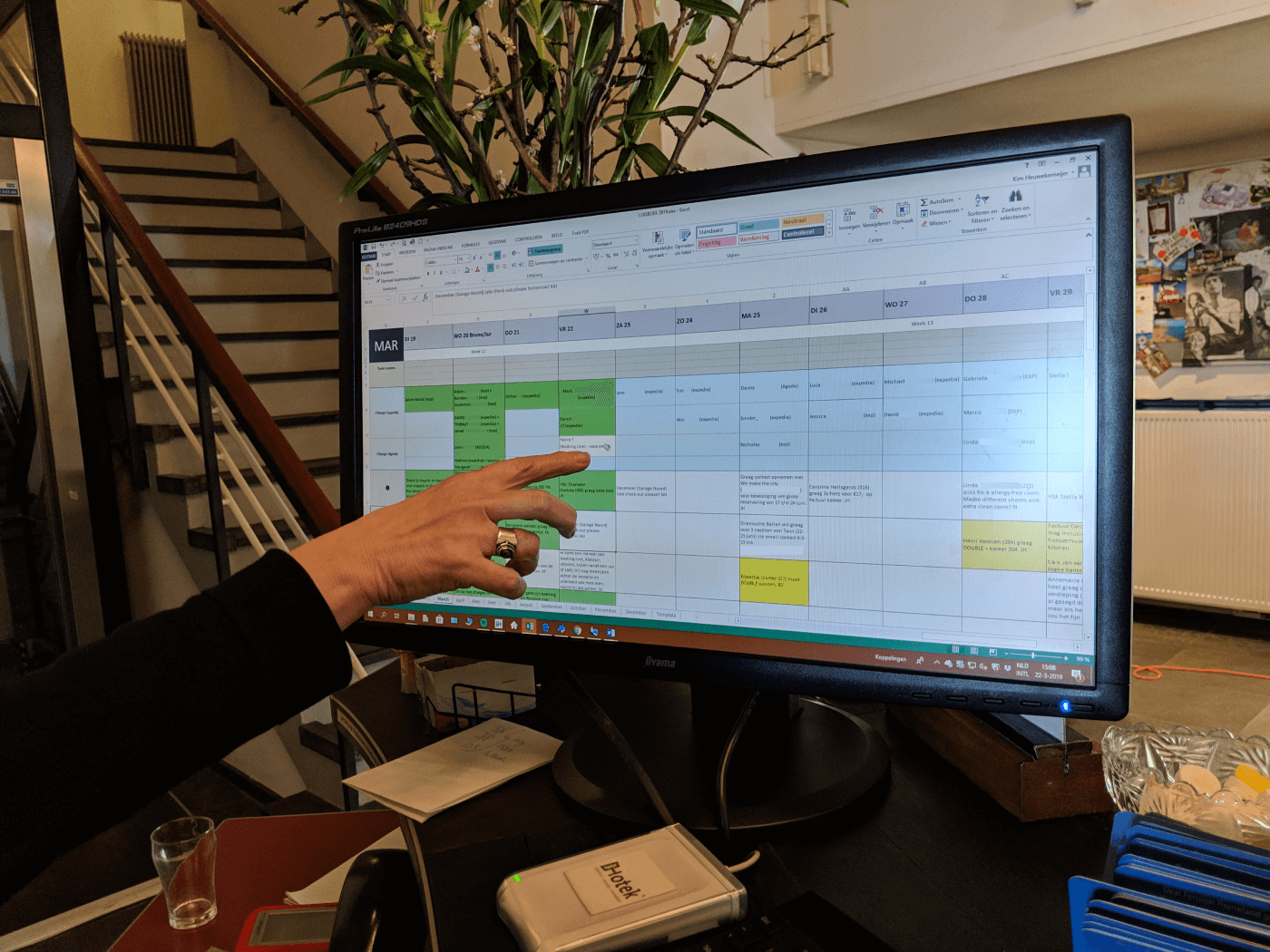
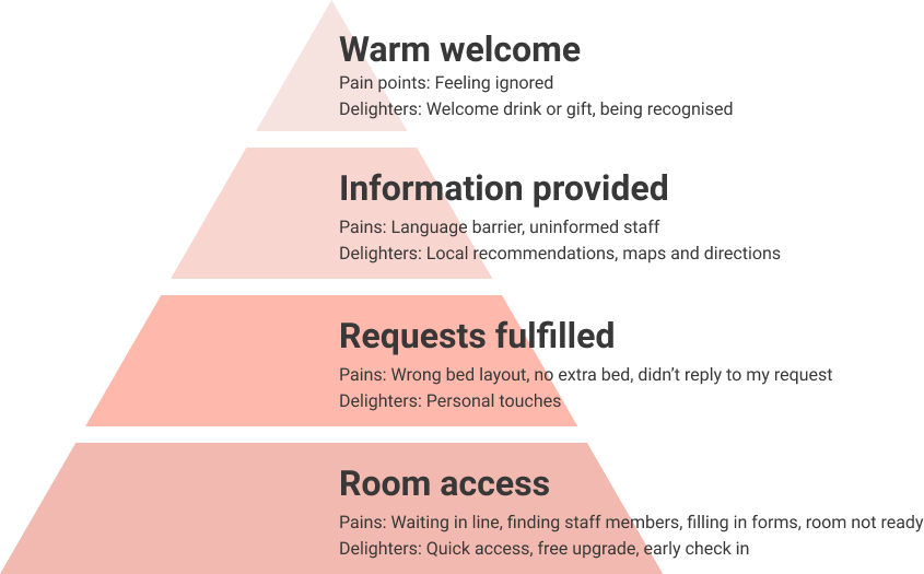
After identifying check-in as our focus point, we dove deeper and talked to guests to help us understand what was and wasn’t valuable to them. Along with a Researcher and Product Manager I ran various forms of qualitative and quantitative research increasing the fidelity as we went: guerilla interviews with travellers in Amsterdam, shadowing reception at a local hotel, dog-fooding check-in experiences at hotels with high review scores, reading through hundreds of public guest reviews and finally running a multi-country survey to size our findings. At this point I created a check-in hierarchy, inspired by Mazlov’s hierarchy of needs, to reflect the importance of different aspects.
From our research I identified the flows and features that really made a difference to guests’ experience. I ran a workshop with the team and stakeholders, we brainstormed the fastest ways we could test our hypothesis.
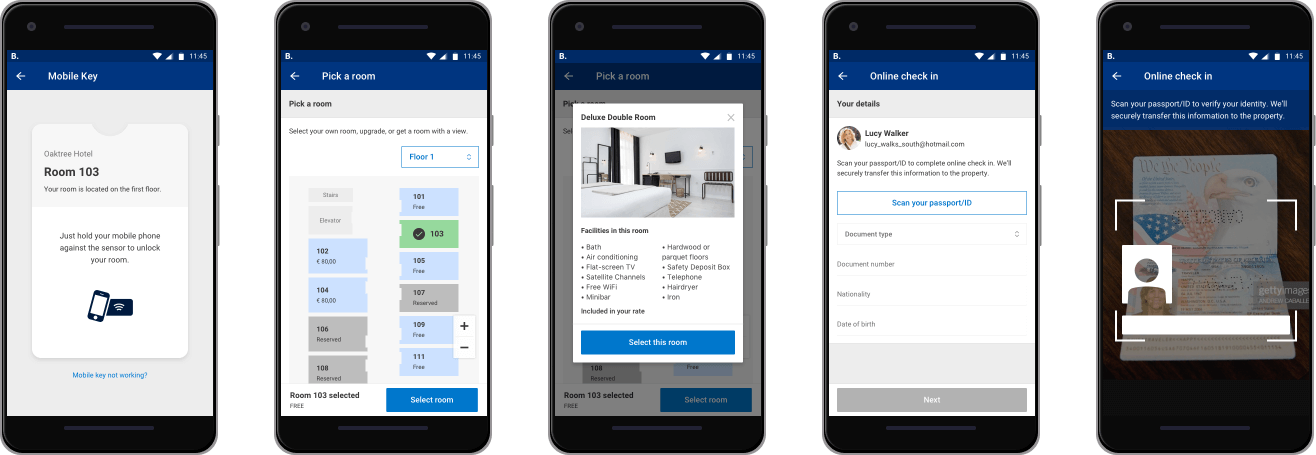
I designed a simple prototype and conducted remote tests with users to test the concepts and gauge reaction to different features. Some features didn’t receive the delight we expected, whilst users seemed universally excited about others.
I refined the designs focusing on the features that had received the best response, and removing those that hadn’t been interesting to potential guests. We launched a pilot to make sure our digital experience would be compatible with the real world operations of hotels. During the pilot we asked guests to give feedback and interviewed those who volunteered for a follow up. Guests were able to highlight areas we’d missed, but also give feedback on the benefits of the process.
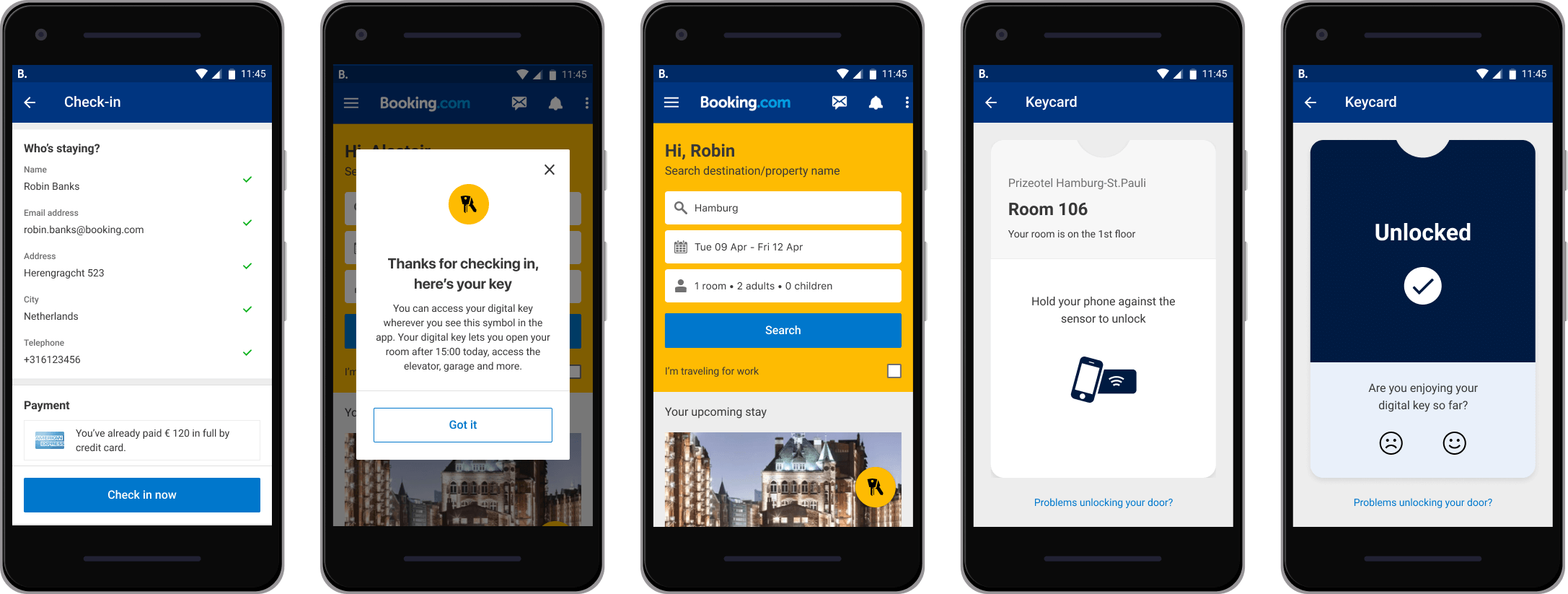
During our pilot I measured the percentage of opt-ins from guests, as well as the percentage of those that completed the online check in. Finally qualitative interviews also gave an indication of guests satisfaction which was aggregated into a satisfaction score. While the number of guests opting in was lower than we expected, indicating we needed to work on that part of the experience further, feedback from guests who actually completed the check in was very positive.
Next project